
As the World Baseball Classic gets underway, we get a look at all the new uniforms, and of course we have opinions. These uniforms will be ranked both from visual aesthetics and design as well as by the history and meaning behind these designs. Not every WBC uniform is created equal, so don’t expect us to pull any punches.
#20 – Great Britain

Great Britain looks like they remembered they needed jerseys the night before. They slapped the most boiler plate block font on it, and the font itself is too small for the jersey. A lot of countries used a solid color jersey with block font, and even amongst a number of jerseys with the same idea, Great Britain stood out for its blandness. Its like they didn’t expect to qualify.
#19 – Nicaragua

There is absolutely nothing wrong with Nicaragua’s uniforms, they just aren’t that special. The jersey works well with the Nicaraguan flag, and the font feels like something we would see on an MLB jersey. While they are only one spot above Great Britain, they are leagues ahead of what the Brits are donning in the tournament this year. Overall, I take no issue with Nicaragua but a lot of the other countries went above and beyond this basic style of uniform. Bonus points for Juan Montes’ mustache, that guy deserves an MLB contract just for that handlebar.
#18 – Chinese Taipei
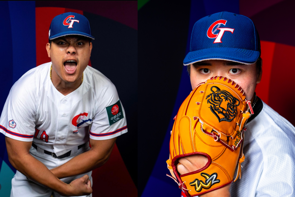
I want to preface this section with an acknowledgement that many people are upset with the WBC calling this nation Chinese Taipei rather than Taiwan. I will be using that name due to that being their official name in the tournament and using “CT” logos for Chinese Taipei on their uniforms.
That being said, I went back and forth on whether or not I liked these. The overall design is actually pretty good. I really liked that they took their old logo and added laces to the “C.” The issue I have is that these are screen printed jerseys. If your national team is playing on baseball’s biggest international stage, pony up for the stitched jerseys. The screen print looks like a travel ball team.
#17 – Panama

These are at the top of my list with the more basic block letter jerseys. Having “Panama” outlined in two colors adds a nice level of depth to the text. One of my favorite parts of the jersey is having the “Fedebeis” logo on the left side of the chest, giving the Panamanian professional baseball league some exposure. Like many of these jerseys, they’re not bad, I just expected better.
#16 – Colombia

Colombia may be a little low, but this is all opinion. The jersey does a good job of featuring the two most prominent colors on the Colombian flag. The Adidas jersey looks particularly nice with the white and blue piping on the ends of the sleeves. The pants feature a red “C,” which is the Colombian baseball logo. The red “C” looks out of place as its not featured anywhere else on the jersey or pants. This uniform reminds me of the Boston City Connect jerseys, and I think that’s what lost it points in my eyes. I never loved those unis, and the yellow is just a little too bright for my taste.
#15 – Mexico

I went back and forth about these uniforms so many times. I really like the font. The overall design falls under the category of big block letters on the front with the first letter big on the hat which definitely hurt its rankings. It is also a near carbon copy of their previous uniforms. At the end of the day, I like the overall look of the Mexico unis, but they aren’t in the top tier.
#14 – Canada

Canada’s uniforms are similar in style to Mexico’s but have a couple of things that bumped them up in the rankings for me. The biggest thing for me is seeing that Canada used a logo on the hat rather than a big “C”. Canada Baseball has its own logo, a maple leaf with a baseball whipping around inside it, and that set it apart for me. These uniforms also get credit due to the fact that they were a big step up from their old uniforms in 2017, both simplifying the design while making it crisper and generally more Canadian.
#13 – Dominican Republic
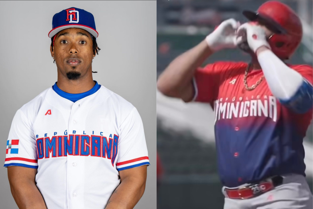
The Dominican Republic may have been one of the most conflicting uniforms I looked at while putting together these rankings. On one hand, their white jerseys are absolutely gorgeous. Simple, classic, elegant, exactly what you want a jersey to be. On the other hand, the gradient jerseys look like a 13U travel ball team that just found out that their distributor could do gradients. It just does not work and honestly looks low effort. So its a split decision on these due to the alternates.
#12 – USA
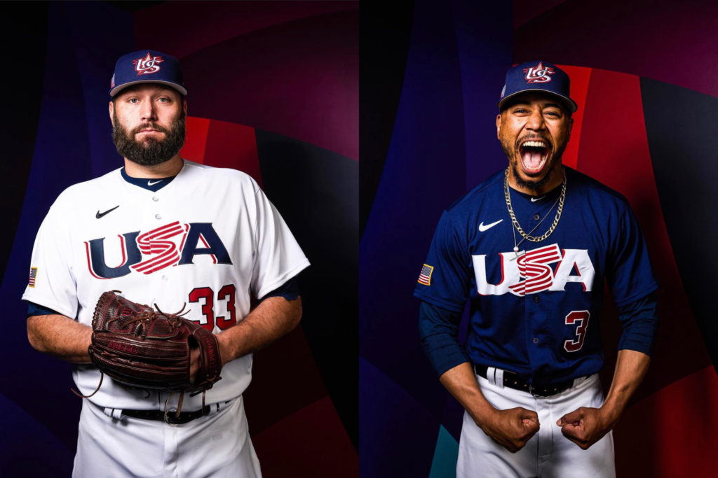
I’m going to catch a lot of flack for putting the US as low as I am, but I’m an impartial journalist. Deal with it. While the logo on the front is an absolute classic and I love the look of it, we’ve used it for years and its now a little dated. It was a good look while it lasted, but the lack of updates sends it way further down my list than most would have expected.
#11 – Czech Republic
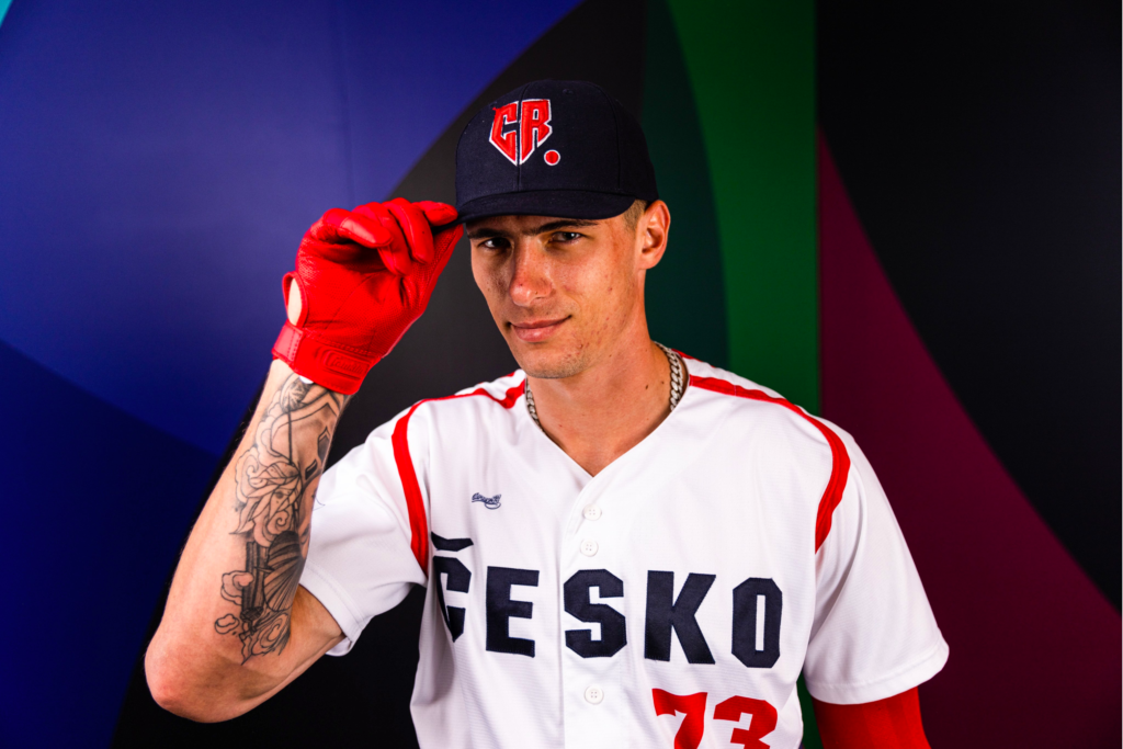
The Czech jerseys are a solid all-around uniform. Everything about the design is well done, I genuinely have zero complaints about what they did here. Two aspects in particular really stood out to me. The first is the usage of the native name “Česko”. Its a nice nod to their heritage and country’s history that was kept simple and well done. The second thing I liked, they put the “CR” for the Czech Republic in the shape of a home plate on the hat.
Maybe I ranked these jerseys a little too high, but how can you not want the plumbers and firemen to win it all.
#10 – Puerto Rico


Puerto Rico is back at it with the grey and white Adidas uniforms, and they are very similar to the ones worn in previous years. Similar to Korea and the white Dominican uniforms, they are for the most part simple and pleasing. The grey uniforms in particular really butter my bread. The white ones, however, I don’t love one certain aspect of. There is a blue silhouette of the Cape San Juan Light and a shore line that just looks a little goofy for my taste. Overall though, these are a perfect #10 spot, the ideal middle-of-the-pack uniform.
#9 – Korea

At one point in time Korea was my #1 uniform in these rankings. The designer understood what colors the human eye likes seeing together, and it works for me.
#8 – Israel

Israel, with a design by Warstic, put together one of the most gorgeous blue pinstripe jerseys I’ve seen, and the definitive third-best pinstripes in the Classic. To me, these uniforms look like a combination of the Blue Jays and Cubs home uniforms, and I love it. The thing about these jerseys I really love is putting the Star of David on the hat. I prefer something other than a letter on the hat, and the Star of David for Israel is absolutely perfect.
#7 – Venezuela

I love these blue and gold uniforms from Venezuela. These colors are tough to combine, but Venezuela made it work for me. They are at #7, though, because they are screen-printed! For the WBC, the Venezuelan boys deserve better.
#6 – China

China has the coolest logo in the WBC. The “C” in China is designed to be a dragon, which standalone is so freaking cool. It gets so much cooler when you look at what dragons symbolize in Chinese culture. In China, Dragons are associated with power and strength. In a tournament to decide who dominates the world in one of the most widely played sports in the world, a symbol of power and dominance goes astronomically hard.

But again, a screen-printed jersey is a no from this guy. You may get tired of me using that as a reason to dox points, but I refuse to compromise on this. They’re terrible.
#5 – Australia

Australia! Good work on these designs. These New Balance jerseys in white and green have a great look, and they did a fantastic job of incorporating the stars in their flag on the hat without mixing the color schemes between the jersey and flag. I put Australia at the #6 spot because of the small design on the lower right side of the jersey. Though hard to see, I was able to get a look at it while watching one of their games, and this is a mixture of aboriginal symbols. There is a rightward-facing arrow that is a hunting boomerang, and a circle surrounded by smaller circles that represent stars. This tribute to the native population of Australia is perhaps one of my favorite design elements used in the Classic this year. You might ask then, why are they not in the top three? Say it with me, NO MORE SCREEN-PRINTED JERSEYS. I hate them, automatic no.
#4 – The Netherlands

At number five we have the Kingdom of the Netherlands. They took a massive step up this year from their previous jerseys. They moved away from the black unis toward white uniforms with navy pinstripes. The big change, however, was the hat. They moved away from the “NL” logo to a crown that works absolutely beautifully with the navy hats. The Netherlands draws a lot of uniform inspiration from its national football team, which famously dons orange kits. Something small but cool is a patch on the sleeve. The Kingdom of the Netherlands includes small tropical islands like Aruba and Curaçao, and players from these islands are able to put a patch on their sleeve that advertises their home island’s tourism industry.
#3 – Cuba
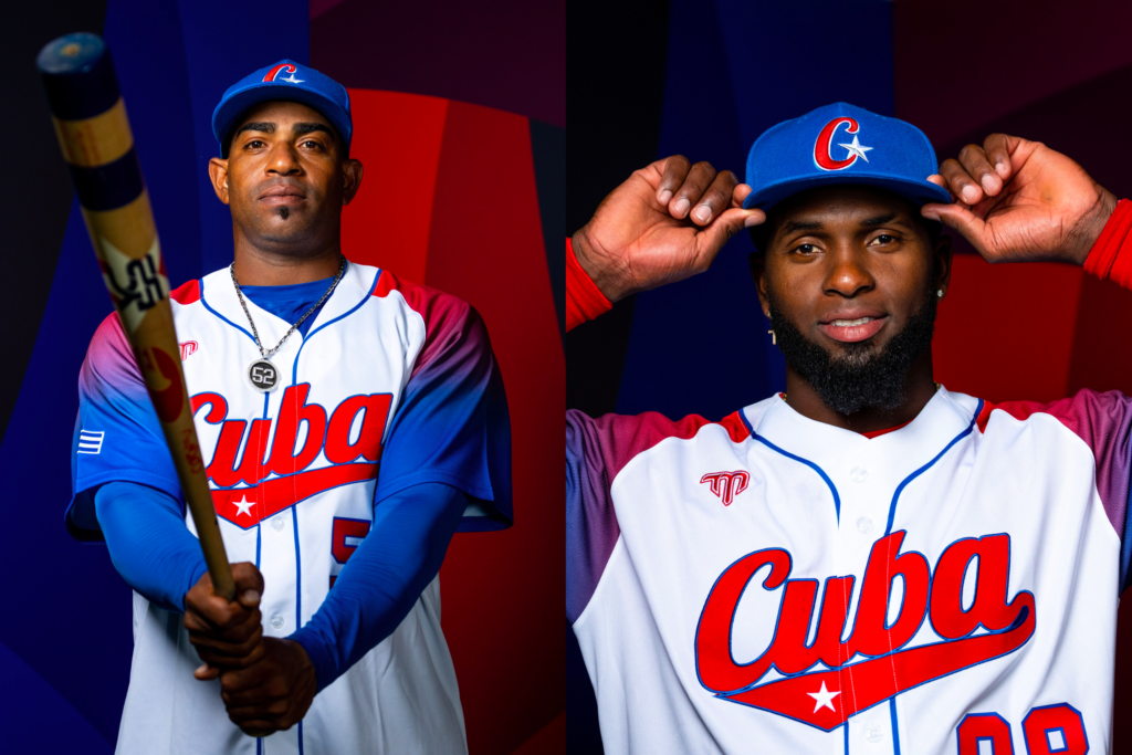
Cuba stayed with their signature style. Cuba in script with a number on the lower left side, as well as a two-color sleeve and body combination. This year, however, they did something unique. They switched from blue to red text for the country name, and the big difference was the addition of a white star in the tail of the script writing. This star was added as a call to their national flag, which has a white star within a red triangle. This is a great addition, and small changes like that really make a big difference. In line with that, they also switched from a simple “C” on the hat to a C with a star, again a nice call to their flag. Lastly, the gradient fade on the sleeves, unlike the Dominican usage on the entire jersey, looks good to me since its used sparingly. It’s a great design element, not a great design.
#2 – Italy

After doing some research and looking into the Italian jersey, it may be my favorite in the tournament, but after excessive polling of people I was hanging out with I decided it shouldn’t be in the top spot. Out the gate, the script “Italia” on the front is too clean. It looks so nice. You may be thinking to yourself, why on God’s green Earth are their uniforms blue and not red, white and green? Both their national baseball team and national football team, known as the Azzurri (the “Blues”), use blue uniforms, and it dates back to the early days of the Kingdom of Italy. This is a connection to the crest of the House of Savoy, which was used on the flag of the Kingdom of Italy at the time. Italy has kept this tradition going, and I am absolutely about it. That level of tradition being kept over a century rocketed the Italian jersey up into the top three.
#1 – Japan

Japan did some amazing work putting together their jerseys for this years World Baseball Classic, so I am naming them the inaugural winner of the WBC Look Good Play Good Award. Congrats, gentlemen. Japan’s main uniforms are Mizuno pinstripes. Japan stuck with the Samurai Japan font and overall look. Japan very effectively took their old uniforms and just improved them. Instead of overhauling the design, they improved the color scheme. Previously, the only two colors were white and navy. This year, they changed the pinstripes to a red and navy helix.

They outlined the letter and numbers in a cream/gold color, and they added a solid navy piping around the collar and buttons. They also switched up the hats, which now have a red J and red stitching with a cream brim and outline on the J. One of the best moves was relocating the Japanese flag to the sleeve from the chest. These uniforms are classics. And guess what, I said I wasn’t going to compromise on my hatred of screen-printeds, but here we are. I’m doing it. Maybe I’m a hypocrite. Maybe these jerseys are just that good. Maybe during this tournament, I’m realizing that I have feelings for Lars Nootbar. Whatever the reason, these are taking home the cake for the 2022 World Baseball Classic uniform rankings.


I understand your hatred of screen-printed jerseys. In Japan’s case, and probably several others, though, they actually aren’t screen printed. The actual threads that make up the uniform are dyed colors to make the design. So it isn’t a blank white shirt with something printed on it, the design is woven or stitched in from the start. I like stitched unforms, too, and fortunately for me, those are actually cheaper replica ones in Japan, where the ones the actual pros wear over there are the ones I described, and way more expensive. You still may not like them, but they are not screen-printed.
The blue silhouette in the Puerto Rico jersey is not the Cape San Juan Light. It’s actually the sentry box of El Morro castle.